Gaming operating system for Playstation 4
Orbis OS. It is the operating system for the sony’s gaming console playstation 4. It is released with the gaming console on January 12,2012. Since it is an operating system for gaming console. The main functions of it are managing games, the game statistics and players’ gamers online community.
Interpret
Then general style of the UI of Orbis OS is simplicity. Since it is an operating system created for gaming console. It fully considered the interaction with the joystick and the trackpad on the gaming controller. Players can input character faster by using the track pad. which the previous generation doesn’t have this feature.
Evaluate
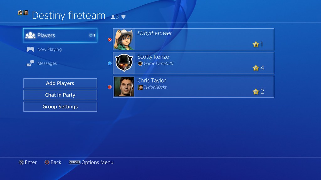
Advantage: Brilliant online communicate experience
The gamer community and the party function are the most stand out feature of Orbis OS. It makes a great experience playing online with other players. Friends list is always at the top part of the interface to show how many players are online. The party chat function allows player invite up to 8 friends to live chat as a “party”. The other friends are able to see the party and join in at any time. Online chatting is a crucial feature to player online. The Orbis OS provides the easy and fluent experience of it for the players.
Weakness: Legacy poor information hierarchy problem from previous generation
The disadvantage of Orbis OS is also obvious. The information hierarchy is confused and lack of proper management such as , the hidden options, repetitive pages and unchangeable games layouts. It is the legacy problem from it’s previous generation. It can be very confused for the player who new to playstation gaming console.
1. Hidden options
The hidden options. The top level of the interface only indicates partial functions of the navigate menu. It only includes the icons of notification, friends list and cups. If the player want to see the full navigations. They need to pull up the left joystick. Then the hidden navigations will appear. The hidden options include one of the most frequent using functions, the setting. What’s more, to terminate a running game or app. The player need to press the option button on the game controller and then the hidden menu will showed up from right. And terminate game icon is on it.
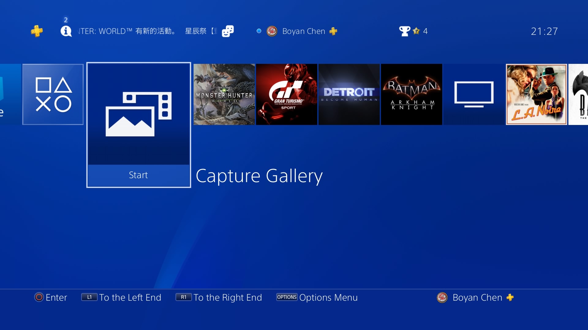
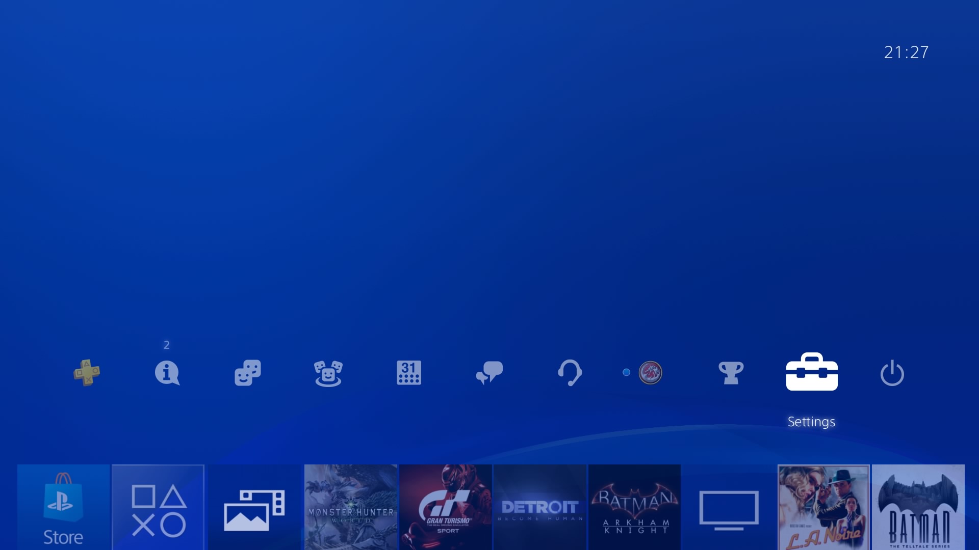
The main index only shows the navigation buttons partially. Player can't see entire buttons with a glance. They have to pull up joystick to see them all
2. Repetitive page
Second, the repetitive pages. In the manage storage page. There is only one storage usage graph to tell user how many storage left. The user need to click the graph again to see the detail storage usage. And there is no other option on the page. These are the two page that should merge together.
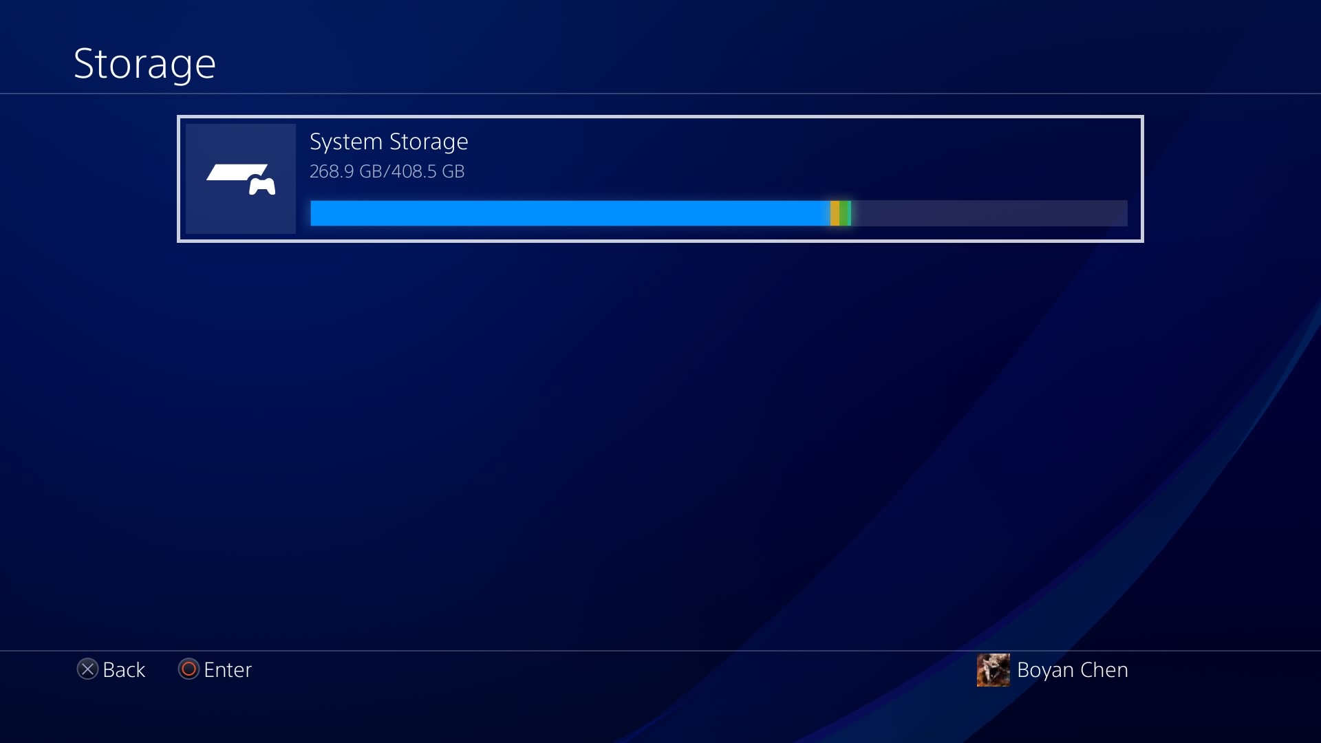
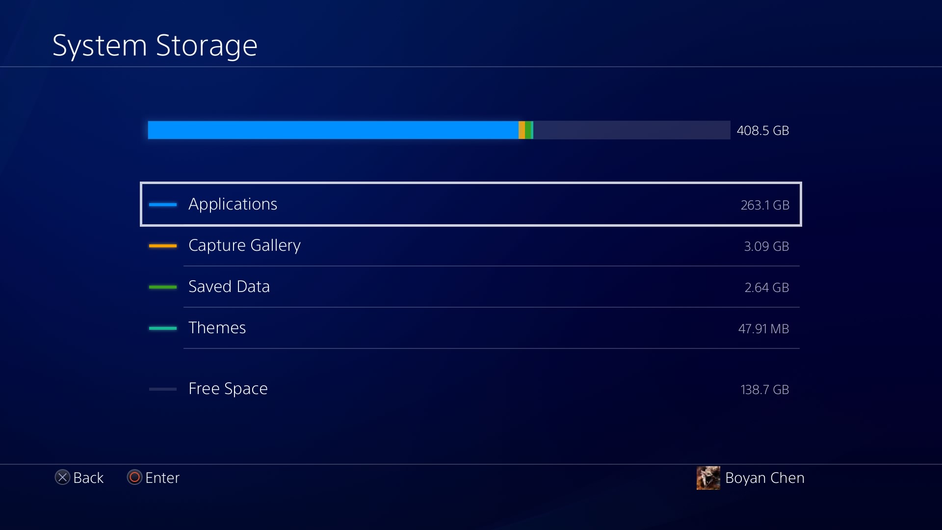
This two page have very similar content. They are supposed to merge together
3. Infinite long program list
The system list the games of player in an endless long horizontal line. Although the most recent played games will be at the first of the line for quick access, it is still very inconvenient for player to switch games. Besides, the apps, album and store are also listed in this long line. It is lack of clear organization or category for these variety of programs. It looks massive and out of management.
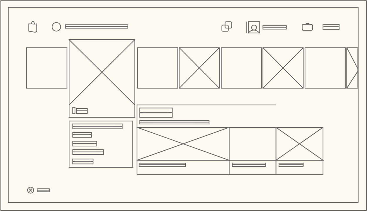
The actual infinite long program list vs Players redesigned